

Colour plays an important role in interior design. It can affect your mood in a positive or negative way, and it can set the ambiance for a particular room. The relationship between room colours and mood is one that has been thoroughly studied and researched, and it has been proven that a room colour can greatly influence your feelings and thoughts.
Before getting into the details about room colours and mood, we need to understand what colour is. A colour is the frequency of the light emitted by the sun (or an artificial light source) that our eyes detect – this is called the visible spectrum (or visible light). Without light, there would be no such thing as colour.
The property of an object (reflective or absorbent) is what gives it a specific colour. For example, a white object is white because it reflects all the light emitted by the sun. A black object is black because it absorbs all the light emitted by the sun. A purple object is purple because it absorbs all the light emitted by the sun except for purple, which it reflects.
Now that we’ve got that covered, let’s dive into the relationship between room colours and mood.
Effects of red
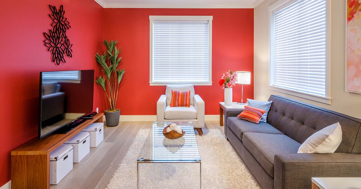
Red has the longest wavelength, which means it is a powerful colour. It has the ability to stimulate us and to raise our heart rate. It provokes a strong reaction in human beings, which is why it is used for traffic lights and stop signs. It pops out and demands to be seen. Red should not be used in rooms that are meant for tranquility and calm; it should be used for rooms that have movement and energy.
Subscribe to 2020 Blog
Effects of green
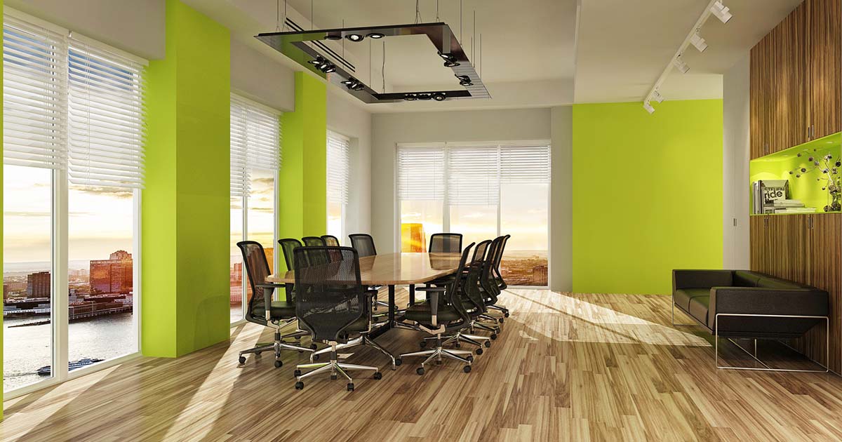
Green is a soothing and refreshing colour that is closely tied to nature. It has a calming effect on most people and can be used in pretty much any room. Green is mainly used to create a relaxing atmosphere, bringing the natural world inside the home. It is also a popular colour used in office spaces to create a calming environment for employees.
Effects of blue
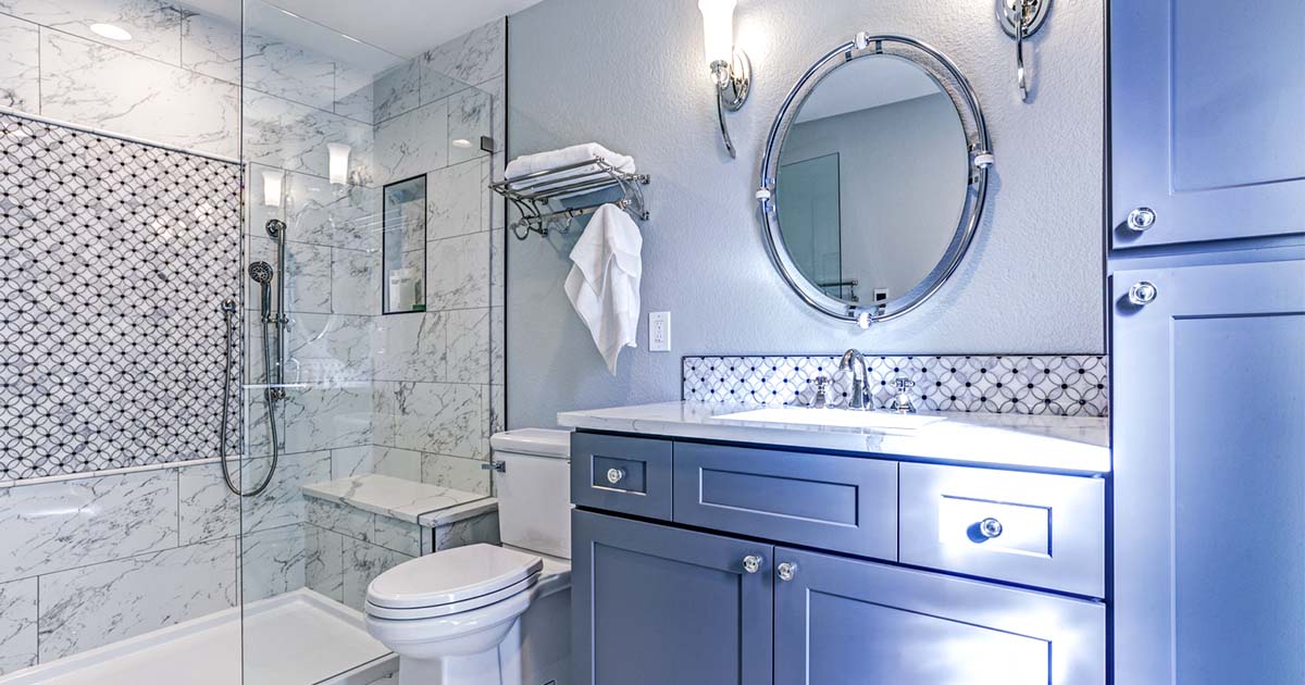
The relationship between room colours and mood becomes very evident when it comes to the colour blue. It is a cool colour, and studies have shown that it can lower blood pressure and even lower your heart rate. Using blue in a room can create a very calming and serene atmosphere, which is why it is recommended for bedrooms and bathrooms.
Effects of orange
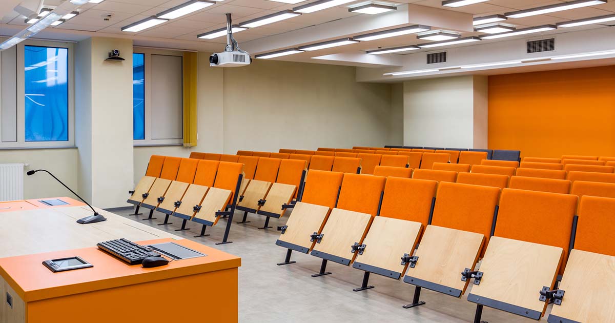
Orange is a close cousin to red and has similar effects on people. It’s an energetic colour that evokes excitement, but it is not as aggressive as red. Although it is not advised to use orange in rooms such as bedrooms, it really depends on the type of orange you are using. A very light tint of orange might be fine for a bedroom, but a saturated orange most likely won’t work. Orange can also be used in classrooms to keep students alert.
Effects of purple
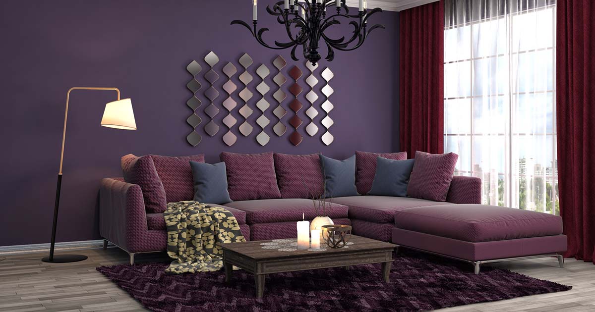
Purple has the shortest wavelength and it is often associated with creativity and luxury. Depending on the type of purple you use for your room, it can either give it a dramatic and sophisticated look, or a more relaxing look. It can be used in any room since it generally doesn’t ensue any negative effects on a person’s mood.
Effects of yellow
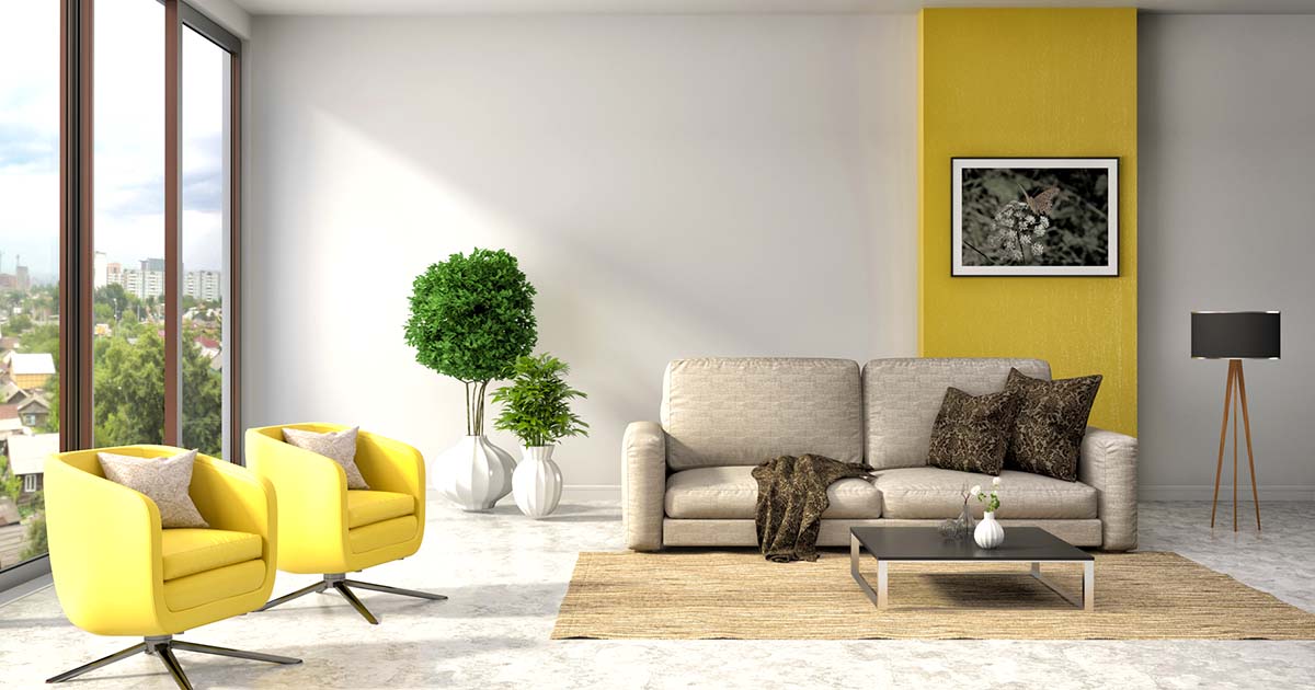
If you want to create a bright and cheerful atmosphere, yellow is the way to go. If you use a light variation of yellow, it can make a space feel very welcoming, whereas if you use a more saturated or darker shade of yellow, it might be overwhelming. A rule of thumb is not to use too much yellow in a space – keep it for accessories, a piece of furniture, or perhaps just an accent wall.
Effects of grey
Grey is a very neutral colour and the emotions it evokes in people depends on the shade or tint of grey that is being used. A darker shade of grey is more dramatic, and a lighter tint of grey is livelier. Grey is an aesthetically calming colour, but using too much of it in a single room can potentially have some negative effects on your mood.


Share this Post